I couldn't help but notice how newbies find difficult to get an android project off to a great start. They get confused. They don't seem to have any clue at all about where to start.
They get lost very quick... What am I supposed to do? Which screen size I go for? What the hell is this and that? and so on 'til they collapse. Well bitches, chill out! Put a smile on your dumb faces and let sunshine in, coz Imma about to reveal the secret behind that horrible mobile operative system that I bet you hate most.

Instead, I love it like the others (iOS, windows and Blackberry). Android just works different. Look at it as you would go to another country. Another language. If you wanna survive, well you better learn how to speak that language in order to put words together that make a common sense.
Back in time, I used to download IDE/SDK of each platform in order to provide developers with views, whether it concerned iOS, android, windows and blackberry.
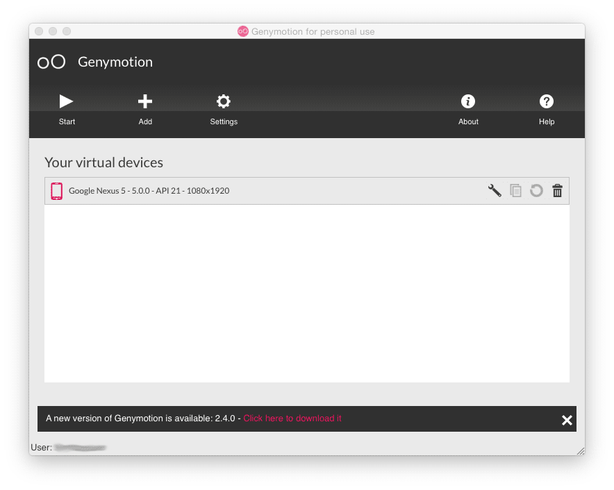
Today as the operative systems is changing, I still keep updating this powerful tools in order to give myself better explanations on how interaction and visual get done. (C'mon, you don't expect me to have thousand phones in my pocket!). Therefore I know how to design better. Since we're speaking Android-like you must know that Eclipse plugin has literally fallen to promote the newer Android Studio at its finest 1.0 version finally (developer.android.com). You may wanna check this out, too... as it offers a wide variety of devices ready to simulate on the go - genymotion.com

Planning is all about analyzing, inspecting, thinking and conceiving ... oh wait a second, what's its name? could it be...DESIGN?! Not to forget Guidelines, whenever these are provided online. It takes your effort coz it's demanding.
But you'll realize it ain't hard to get knowledge into this piece of material. Go out there, be creative, search, study and destroy...mind over matter!. For instance, take a close look at this webpage developer.android.com. What do you get? I see the solution you were looking for.
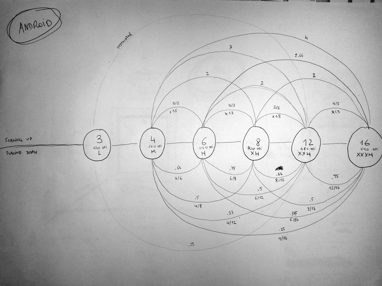
First off, you must consider that they have been deploying Android into a wide variety of devices since its birth, unlike iOS. I'd like to say Windows, too. Maybe at the beginning in 2010, but even this one got lost into different screen sizes in order to serve a big market demand. Remember the alliance with nokia? (We'll discuss this another time). Below, I sketched the metrics really quick on a piece of paper. As I already did long time ago, this gave me the opportunity to reflect on how things work. As a mater of fact, I learned that everything is based upon a famous metrics-law, the scaling ratio 3:4:6:8:12...
meaning that you must
multiple ldpi * 3/4 to go from ldpi to mdpi,
multiple mdpi * 4/6 to go from mdpi to hdpi,
multiple hdpi * 6/8 to go from hdpi to xhdpi,
multiple xhdpi * 8/12 to go from xhdpi to xxhdpi ...
Check this scaling up/down. I got 'til 16 as I heard of newer devices built on better screen by the time I'm typing.

Second, you must know what devices your client wants to put in front of others. Once, you know the answer, you're ready to go.
Now you know where the starting point is, in terms of resolution:
- emirweb.com
- viewportsizes.com
- mydevice.io (downloadable from market place to check what your device screen info. Useful)
At this point, you have two choices. On the one hand, you may wanna lay the foundations for the entire project based on the lowest resolution (160 dpi, remember that 120 has been deprecated). If so, your user-interface (Ui) must include graphics that can be scaled up without losing quality, talking about vectors (e.g. - give a chance to shape layer, would ya'll?). Don't forget images at big resolution. This way visual won't affect your RAM, guaranteed. Also you may appreciate this approach, once it comes the time to hand assets over (See my production process). This means that asset is already sets on its marks, as developers build views based on lowest aspect-ratio.
On the other hand, you may wanna start with the highest resolution (480dpi), unless you have a 21 inch screen plus a minimum of 12GB RAM to work, of course. Just keep in mind, when scaling down, watch for text layering and their font-size with extra comma values. Unlike the first approach, this one force you to re-calculate dimensions in order to provide developers with correct metrics (See my production process).
Either you go for one or the other...depending on what resolution, you better set your document properly in Preferences > Guides, Gridline & Slice and switch the values at the labels Gridline every and Subdivision. You're done! Now you're set to create screens as Material Design Specification suggest.
Anytime, any technique shouldn't prevent you people from making a neat, clean and smooth Ui as described before.
Finally, I'm happy to see how the design scenario is changing in favor of orderliness. Could it be tools are getting a better shape forcing designers to keep it clean? (we'll discuss this another time)
Also, consider that small things make great distinction. Just giving you a couple examples:
As I already mentioned, go out there and find what fits your need most. Tools you might need:
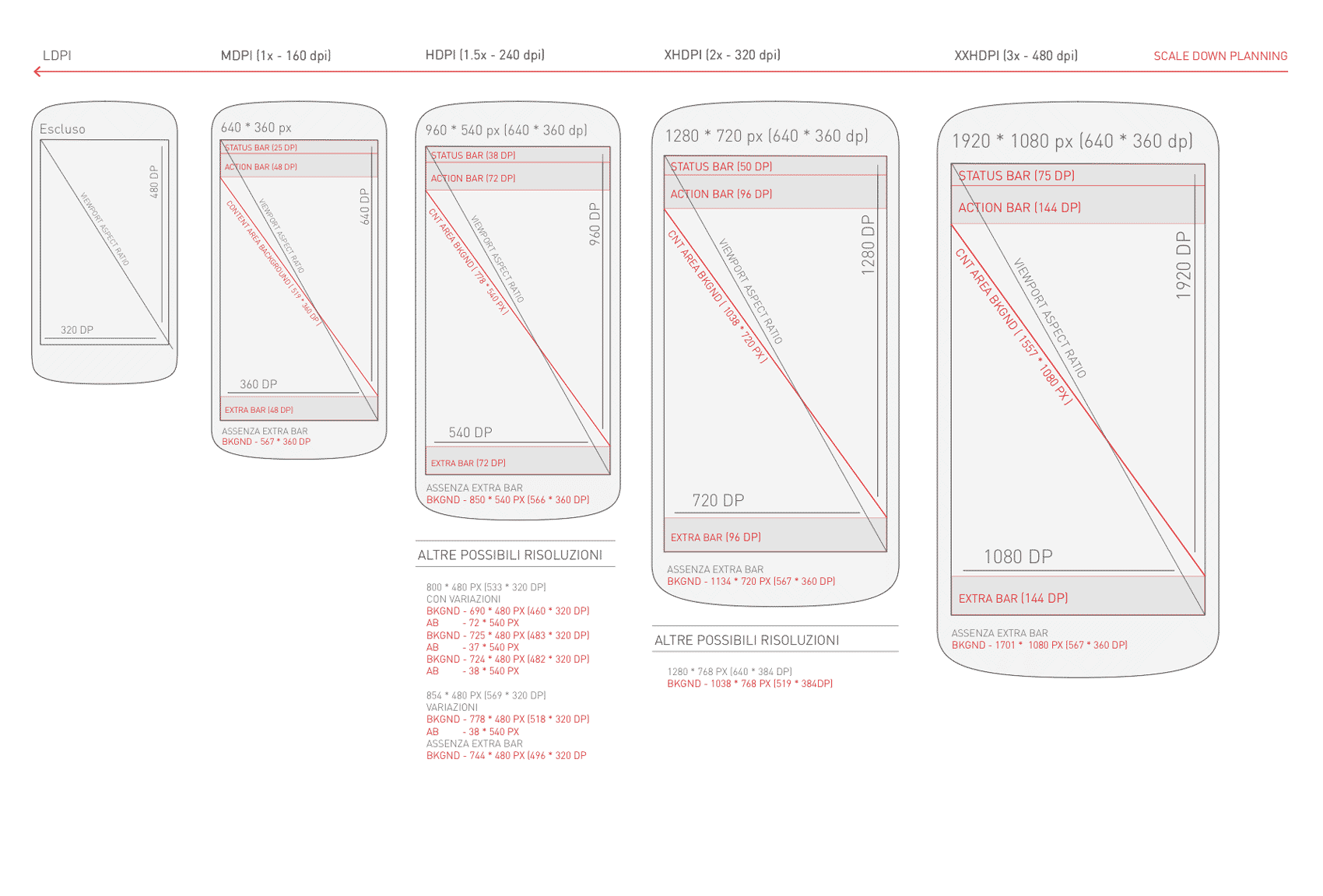
One more thing .... As I've gone down deeper into Android matter, I realize whether to include height and margins or not depending on what devices the app should be deployed. Angel of death come and get me, now!
Yes, you know what I mean. For instance, not every device has got soft-key into the screen, coz some others were expected to be outside, on the hardware shell. So far, I absolutely needed a visual guide reference. Couldn't find anyone ... anywhere, so I built it myself (see image below). It's based on android-devices sold in the store nowadays.


