Since I left the FrontEnd Development in 2015, I've been asked a lot from developers about the following issue: what's the key factor to know wether you're in front of a Laptop or a Desktop device? I'm speaking in terms of coding, otherwise you'd be blind, guys!
I clearly remember when CSS came out with selectors MediaQuery at the same time Html5 was put out, may years ago (am I getting old?). Thanks to MediaQuery, FrontEnd Developers, included me back in time, could operate in a such way to detect screen resolution and even their properties like Aspect-Ratio, Retina or DPi. Doing so we finally could break free from strategies like WURLF for device detection!
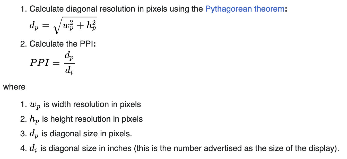
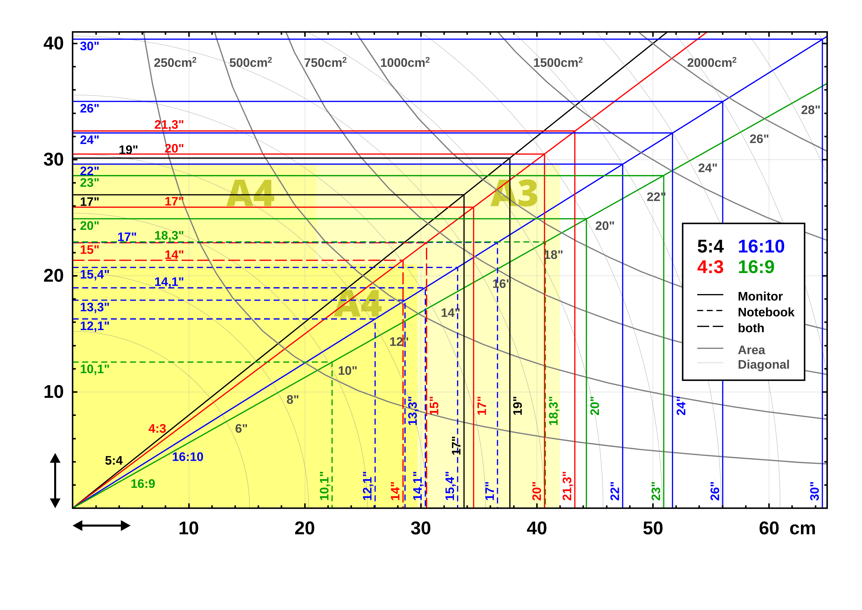
But wait, what's PPi stand for? It's an acronym for PixelPerInch and it's used to calculate the size of a screen. How? Simply applying the Pitagora Theorem. I know, math ... again. It can be easily implemented in Javascript
$(window).height();
$(window).width();
This along/or with CSS and you can get get the screen diagonal. As today normally, a Desktop starts at 17 inches , but remember that these values changes for technology and hardware evolution. Also, this is a simple tool online to find out what's your screen and device properties.
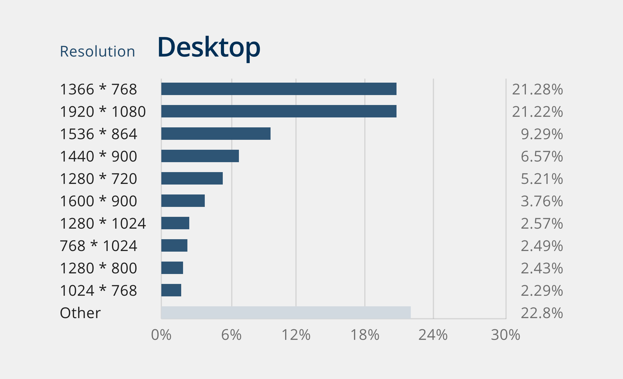
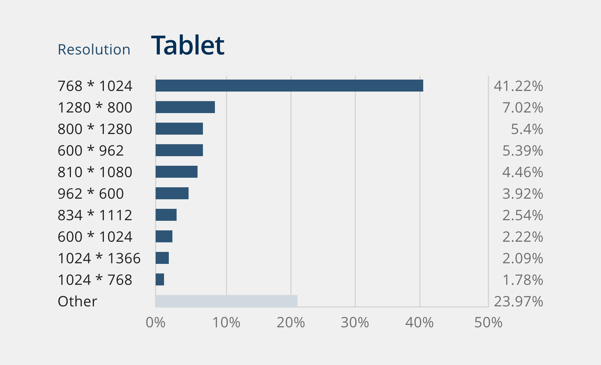
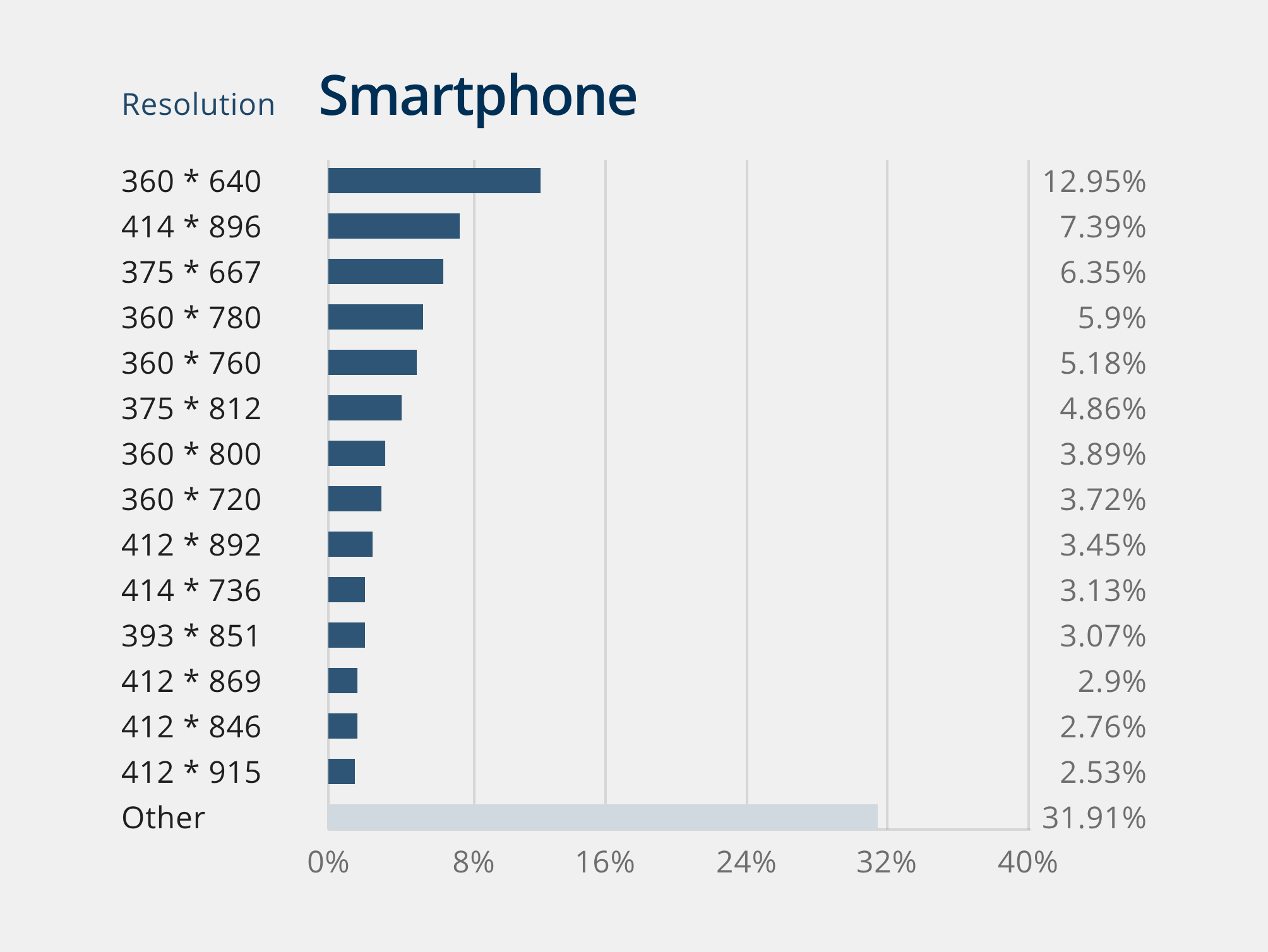
Matter of fact it's critical to start form the Design Foundation, before coding. What do I mean? Statistics, like researching the most screen resolution used nowadays.
The exposed viewports are a default, useful for the heuristic evaluation of the product and they should be the standard of development process for a about 5 years, enough to cover the historical need of the user relationship and hardware advancement. I designed the following image that shows Viewport range and their relative Breakpoints, based on international statistic datas reported in 2024.
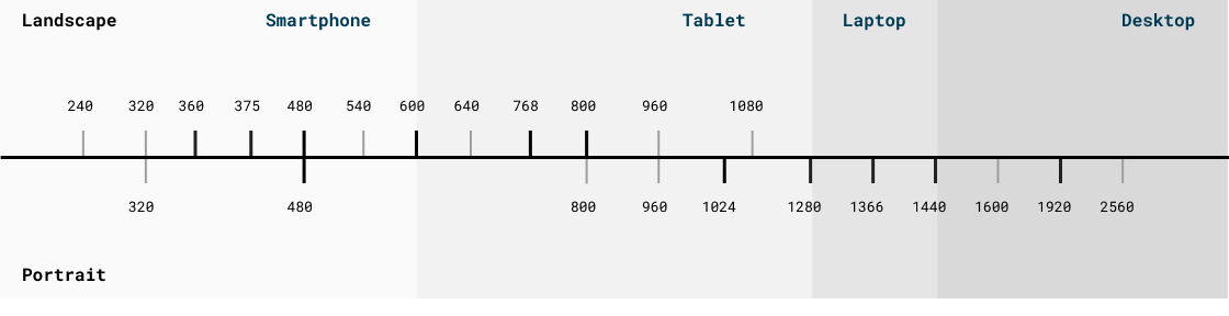
These values could change depending on the real needs of the destination Brand, as long as objective analyses are carried out in the field within the latter through Google Analytics or Dynatrace which highlight the use of desktop and mobile devices, browsers and related browser versions, operating systems that end users make of the product. I could apply this strategy for the Cattolica Brand, and it turns out to be very useful for understanding how to proceed in these cases, that is, once the real perimeters have been identified, these should be the place where to concentrate and employ more work time.
However, the entire set of the above values must be considered for all breakpoints without any exclusion, since for technical reasons it is necessary to intercept the unknown dimensions of the browser which could change anytime for user decisions wether it's a responsive or adaptive. One I've got the final research results, I designed a chart that summarize all, like so: