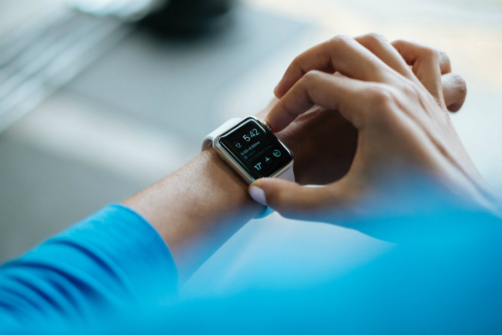
Som' is wrong here! Help me clear this up. Apple and Android came out with their new toys they call smart watch
and I can't stop humbling why they gave us these wierd aspect-ratios? As usual, check out at guidelines. They've uploaded everything you need to get a closer look. I had to go thru this, since I designed the official Valentino and Feltrinelli App on these "weirdos" displays. See projects at Valentino Store and Feltrinelli Store

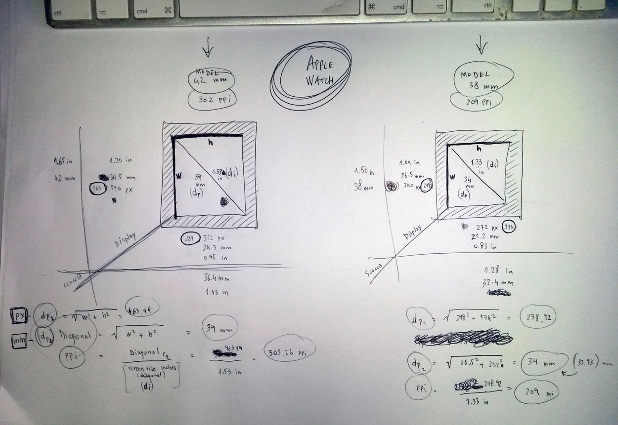
Apple watch
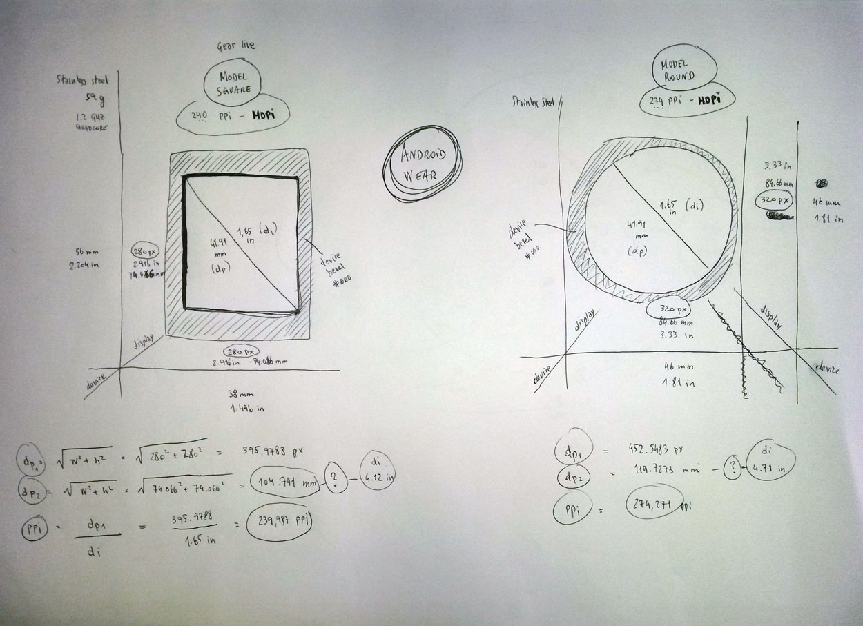
Android Wear
Let's jump right in. As simple high-school math taught us, not everything looks the same to me. To be ironic, I call this the math.round() effects. As you can easily notice from the images below, PPi ain't the official metrics:
Apple Watch
model 42 mm: 1.53" - 390*312px
model 32 mm: 1.33" -  340*272px
Android Wear (hdpi)
model square: 1.65" - 280px
model round: 1.65" - 320px Not to mention the war between these two gigantic industries to achieve the best screen quality in order to reach people's desires! Remember the contest between iPhone 6 plus and Nexus 5? Have you noticed they have about the same PPi?


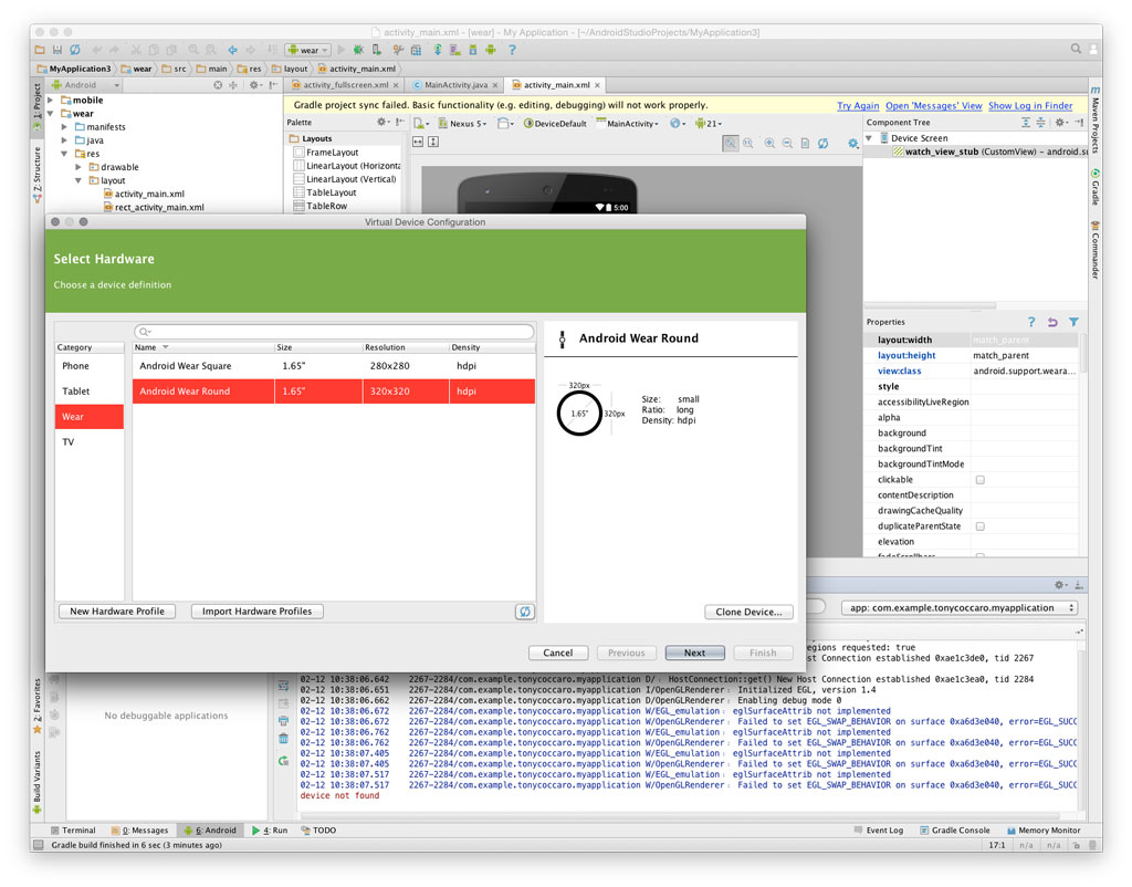
Finally, what screen resolution are designers supposed to create? Answers can be found between you as designer and developer next to you. Also do what I do, launch your virtual device and take a look at the configuration panel (e.g. using Android Studio).
Then give a try: create a view and test components between ui-assets and emulator. Afterall, they just put it out there. Now it's up to people like us to give the best shape design by testing new ui-patterns.

Speaking of patterns take a look at what others have already came up with apple watch
Check out android wear concepts as well


