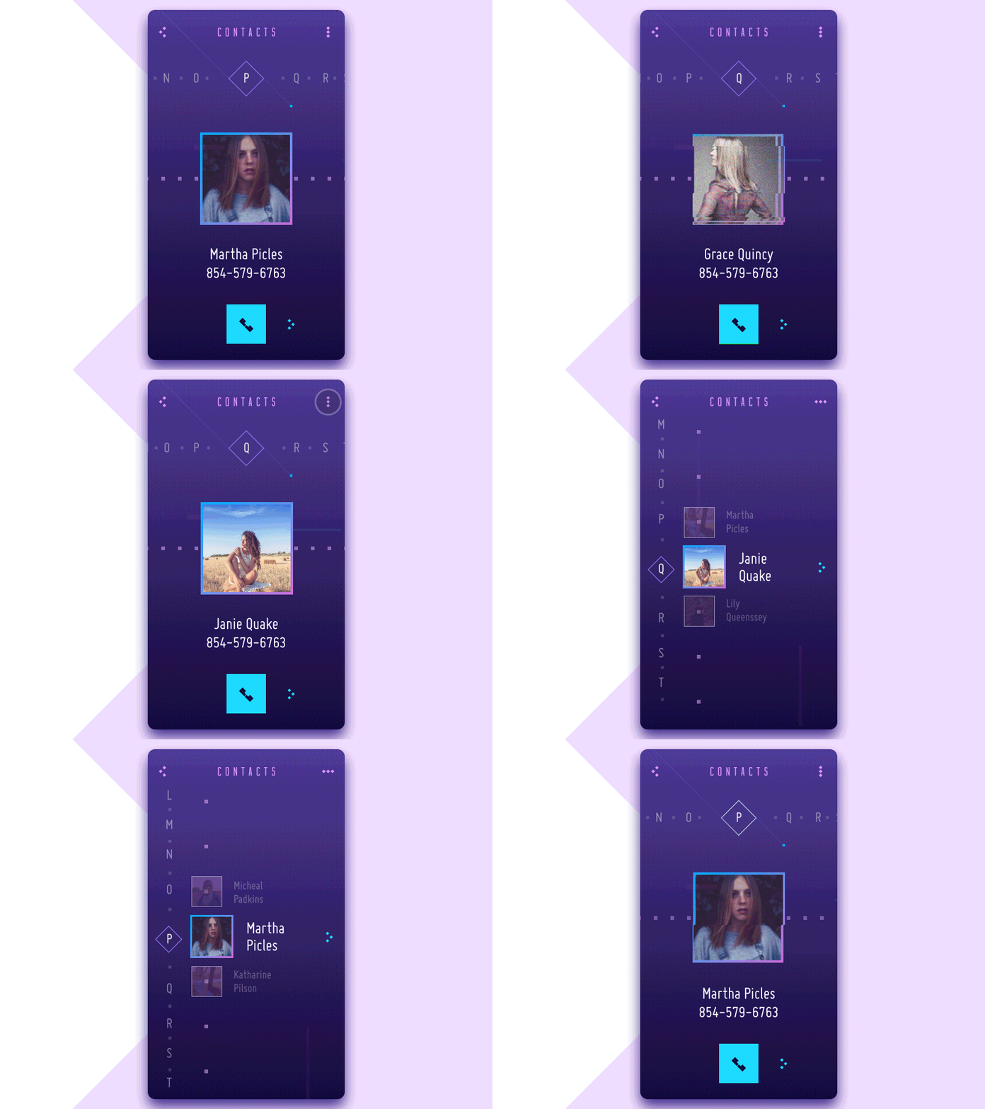
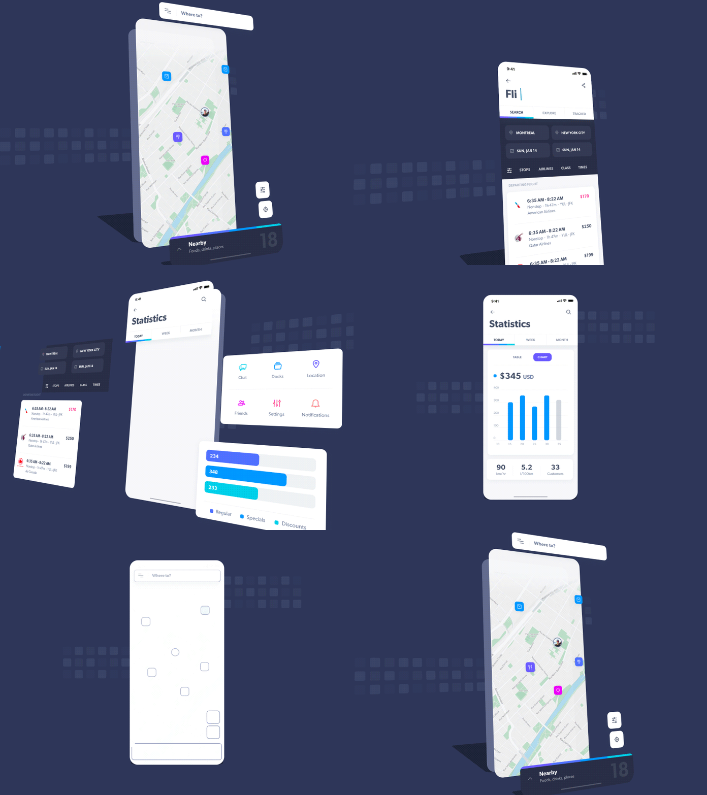
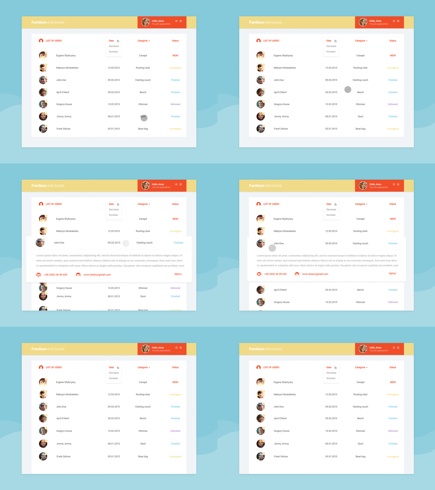
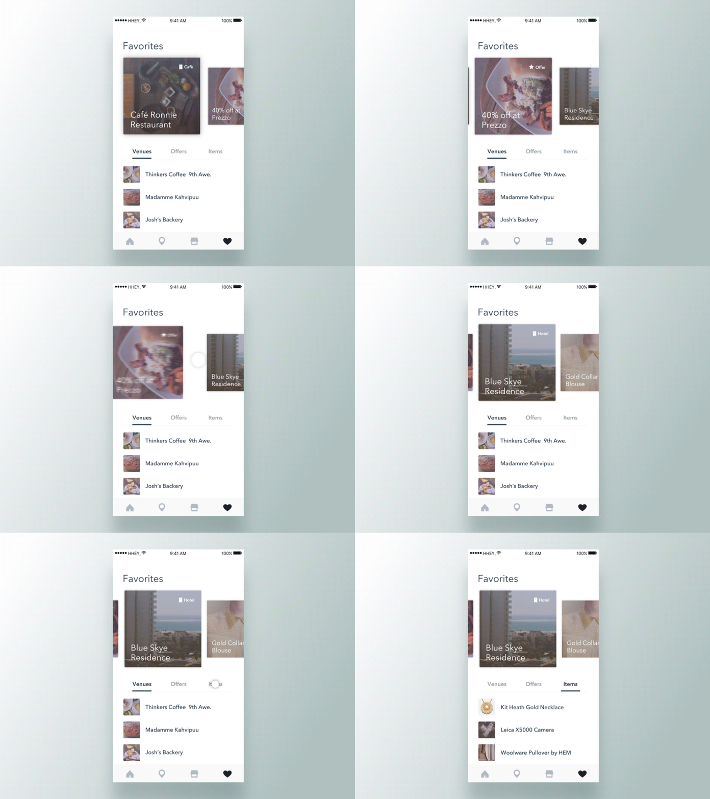
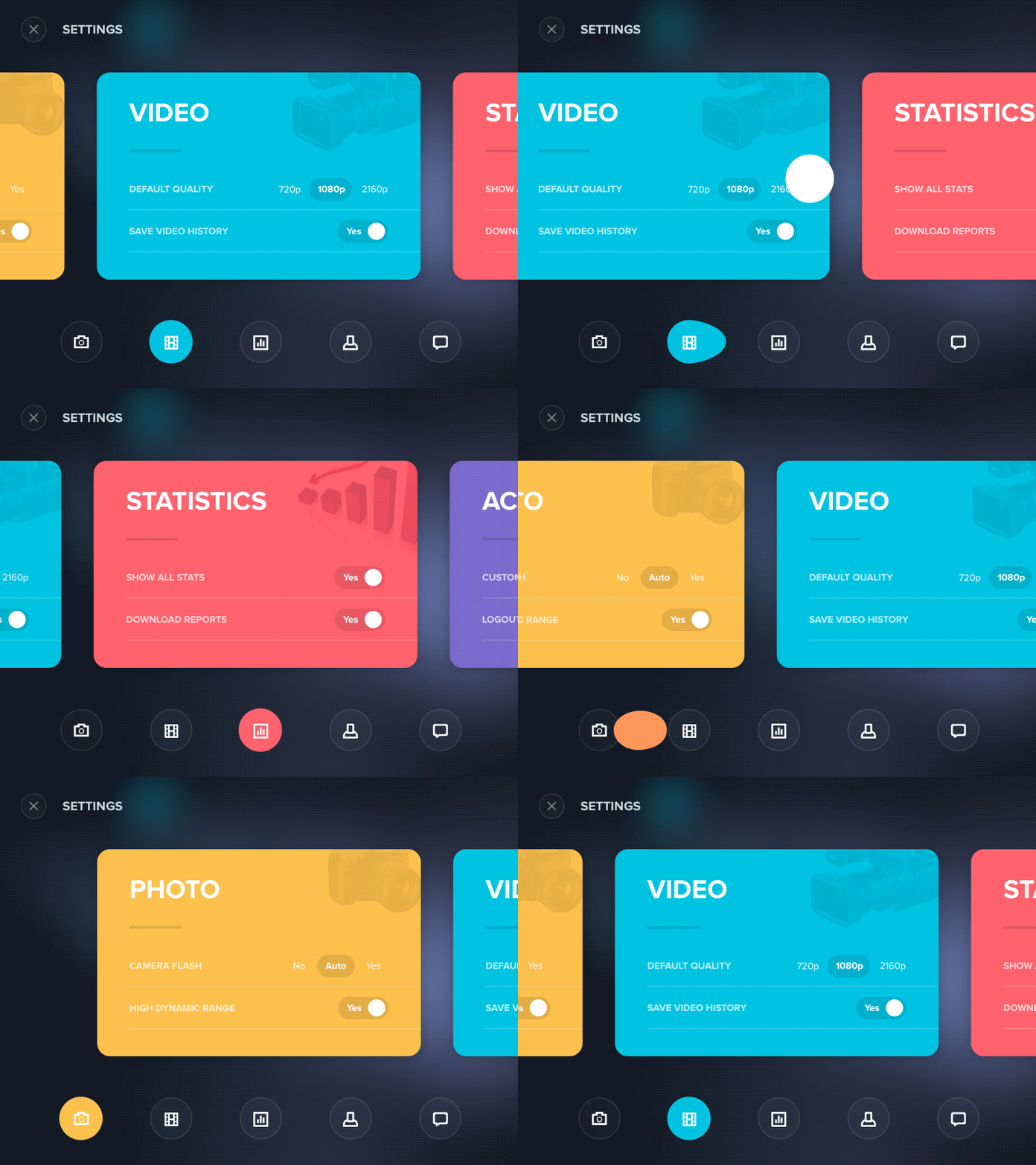
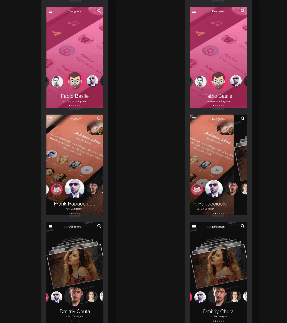
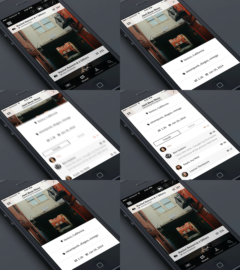
Making Framer prototypes can communicate what a final product will feel like early in the design process. I find working with Framer rewarding because it forces me to think through the logic and flow of a design in a very tangible way.
Building a prototype also helps me gain empathy for some of what engineers will go through when building the product. If it’s difficult to figure out the interactions in Framer, there is probably some sort of fundamental flaw or ambiguity in the design.
Before you go on, you may want to read my thoughts on design system process and sketch, wireframe and prototype or even animation history, just to give you a better idea on what I'm about to share below.
For the uninitiated, FramerJS is a Javascript framework for prototyping motion and interactions. That means it’s a set of Javascript functions that will make your life easier when you’re prototyping. You will need to know the basics of programming to capture its full potential, but the Framer team has created Framer Studio to assist in the creation of these prototypes.
Anyway, you shouldn't be afraid of coding. The most important thing to remember is that you do not have to know everything to begin. Start with the foundations of a programming language and aim to continually improve. A key thing to remember is that in programming, there is usually a smarter way to solve a problem and chances are, there is documentation to prove it. Even the most advanced users pick up new tricks from inspecting other people's code ( I feel lucky, as I already studied these "basics", while sitting in the back of bus going to the Arizona State University in the beginning of this century :P ). Go check these pages to get a comprehensive view on its basics and coffeescript programming
Framer is not for production. And that’s a good thing! Framer isn’t an attempt to accelerate or bypass the development process. Where some designers may write HTML or CSS to facilitate accurate front-end development, Framer can be seen as more of a communication and validation tool. Considering that Framer produces very messy code (a slew of divs with inline styles), very little of what is written in FramerJS will actually be used to create the real product. Some motion parameters may still be relevant (delay, easing, and timing) but very few lines of code will still translate to the development process.
They say Framer is for communication. This isn’t only true of Framer, it’s true of all prototyping tools. Prototyping inherently lends itself to answering questions, validating ideas, and proving concepts. Instead of describing animations to a developer (or watching over their shoulder), Framer empowers the designer to add interactions and motion to their prototypes, and more accurately communicate the vision of their design.
Framer prevents the need to recreate designs before prototyping. Framer Import skips the redundancy (like I always do importing Photoshop layers), and maintains the integrity of the design layers to facilitate quick prototyping. All of the artwork is preserved as it is brought into Framer, ready to be animated and manipulated.
Many tools are leveraging drag-and-drop interfaces to mimic what would normally take complex code to produce. Framer is simplifying the code to lower the learning curve for creating complex prototypes. Neither approach is wrong, and both have their advantages. Framer is the future. Thus with so many prototyping tools popping up, I wanted to give Framer Studio a shot, years ago. When you first open the app, you are presented with a code editor on the left pane and an instant preview of the code on the right. This makes experimenting with the code pretty easy.
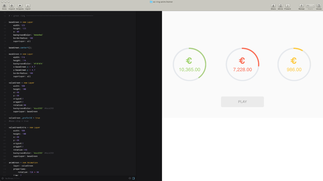
I've produced some prototypes along the way with Framer and they tend to be either long or short flows with many different or few states. Actually I'm developing a pretty rapid system for converting a Ui-design into a robust prototype by anticipating issues that usually occur later in the process.
Doing so, I often come up with different ideas while building Ui blocks all over the interface and today I decided to share this one of mine, a sample animation as a way of how you can handle an hypothetical a specific cirlce graphics inside an app prototype workflow with Framer. Believe me it makes the process really fast. So I took this animation outta project I was committed to, Lottomaticard and Imma show you down below (otherwise check it out at full screen here ). The goal is to visualize the money balance of prepaid cards in the form of a pie-graph ... Looks like a job for me. I said — eureka! spinning rings like spinning wheels, bro! They're spinning'!!!
CONCEPT
Before we go any further, I'd like you to put Photoshop and Framer aside and grab a pencil to focus on the art of sketches! Believe me, it's the best way ever to start off a project on scratch, for different reasons.
Think about it, you save time in the long run since the art of sketching allows you to paint your thoughts on the go. Thus, what's the trick behind this ring animation I came up with? Mask and Base are two circle primitives. The Former is smaller and it's set on top of the latter. Considering that the third layer, Value, is a square primitive (cropped by base), the idea gives the final effect of the ring with a portion colored . Got it? Let me show you below
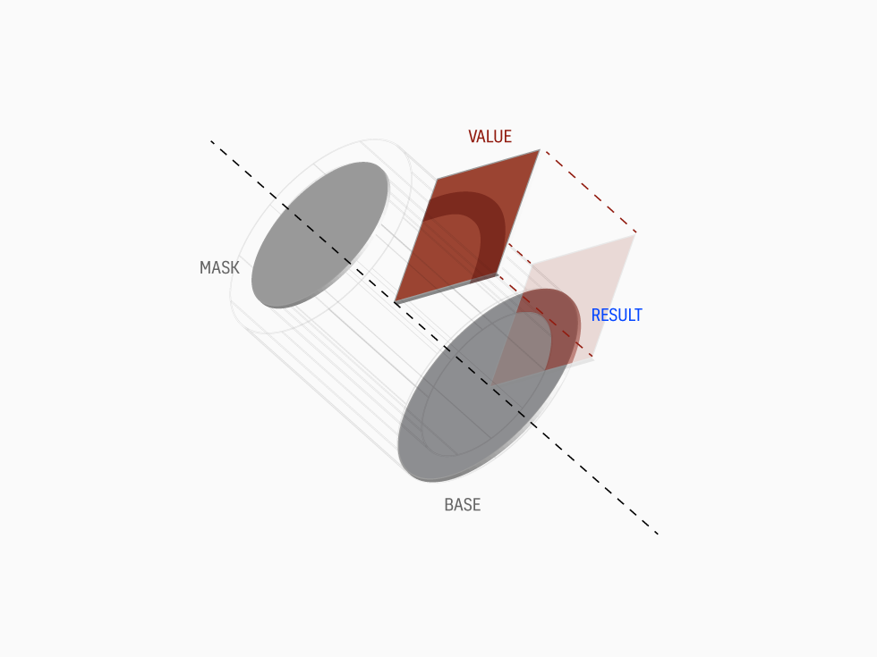
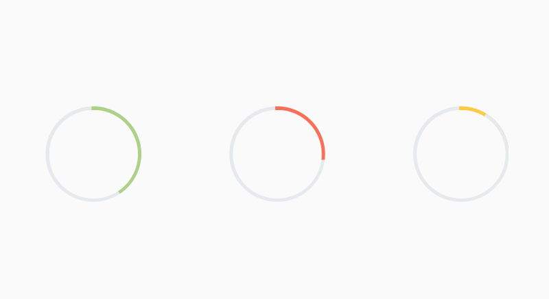
I decide to create three rings: green, red and yellow. Each one achieves a different results like any other pie-graph on any bank app interface you might run into. Red shows a quarter (the value itself), Green more than a quarter and Yellow less than a quarter ... but "Hey wait a minute" — you would say " If a quarter is represented by a square, how do you make Green and Yellow?" — Also you would ask "But if you’re going to code your prototype, do it like expert programmers would do with complex math calculation like Sine and Cosine". Not the case my friend, coz I'm not coding in the language of the end-product. This may be ignorant of beginner. I can’t code in Swift nor Java, dear designer (unless you're a developer too). My skills are limited to basic front-end Javascript frameworks, yet I still want to be able to create realistic, platform-agnostic prototypes. And framer allows me to leverage my knowledge of Javascript to create these types of prototypes.
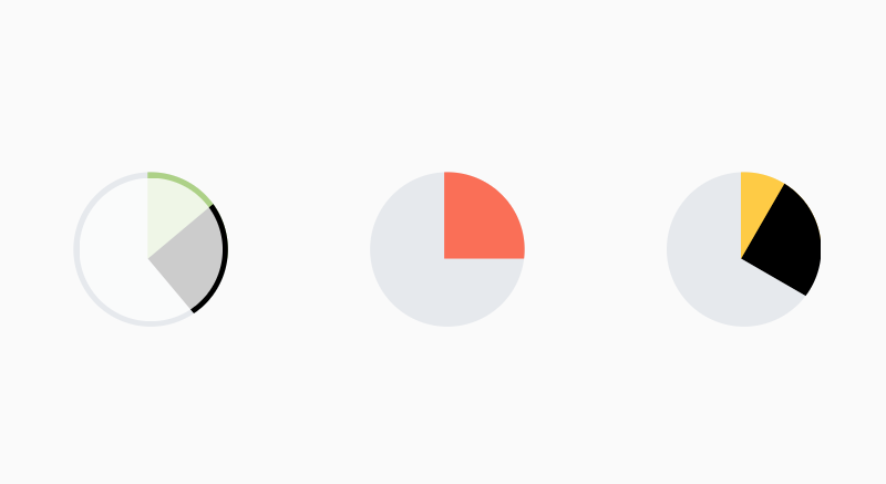
Back to Yellow and Green. My trick was creating another cropped square value (Extra in black color) and attach it to the first square as children. Considering the pivot set at bottom-left, I would rotate this Extra value to the desired degree, less or more depending on how much "value" I want to show. Remember this is prototyping, not the final real product. No need to make complex math calculations :P
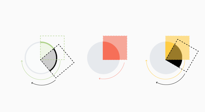
ROCK N ROLL
There we go now. The fun part is coming. Coding my thoughts has never been much easier with Framer. Keep in mind that I'm not importing anything either from Sketch or Photoshop. No need in my opinion. Primitives like these above can be quickly reproduced via few lines of code.
As you can see coding process start off with these kind of thoughts. Think about it before you move on Framer. Once you have it down, go away with it. Let's kick in with the Green ring where valueGreenExtra is the black square children I told you about
baseGreen = new Layer
     width: 125
     height: 125
     x: 40
     backgroundColor: '#e6e9ed'
     borderRadius: 100
maskGreen = new Layer
width: 116
height: 116
backgroundColor: '#FAFAFA'
x:base.x + 4.7
y:base.y + 4.7
borderRadius: 100As you can see the famous Extra square, valueGreenExtra layer, has the same properties of value layer (like color, I painted with black for explaining purpose), but rotated to my desire preference (55 degrees more than 90, then 145). Instead, Yellow ring would have an Extra square painted with BaseYellow color. Remember that I want opposite effect: less value. OriginX-Y controls the pivot I mentioned before. Superlayer links it to the base layer.
valueGreen = new Layer
     width: 100
     height: 100
     x:-40
     y:-30
     originX:1
     originY:1
     rotation:90
     backgroundColor: '#acd283'
     superLayer: baseGreen
valueGreenExtra = new Layer
width: 100
height: 100
x:-40
y:-30
originX:1
originY:1
rotation:145
backgroundColor: '#acd283'
superLayer: baseGreenNow that you've just layed down your layers, focus on value the portion color that must be intersect between the base and the mask, you can go for clipping (crop) this value. As you might be beginner on Framer, let me introduce you to
valueGreen._prefer2d = true or even baseGreen.clip = true
Once you're satisfy with these settings, move on to animation part . Layer properties tells what layer has to be animated. Rotation according to it's position as well. And you're good to go!
animGreen = new Animation
     layer: value
     properties:  rotation: 720 + 90
     time: 2
     curve: 'ease-out'
     #delay:0.3

animGreen.start()
animGreenExtra = new Animation
layer: value1more
properties: rotation: 720 + 140
time: 2
curve: 'ease-out'
#delay:0.3
animGreenExtra.start()SAMPLES
This is for ya'll to watch and enjoy.
I've collected a bunch of Ui animations made by other talented Designers
