
Style Guide 3.1
Time goes by, meanwhile this project has leveled up. Gotta renew the content
Guidance System
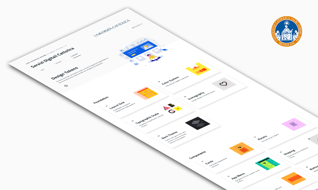
The idea of a Digital Style Guide was born in order to distribute the visual consistency of Cattolica brand identity through new web portals such as Iscrizioni, Lauree, Mobilità. At the same time I could apply the same Library for other customers I was working on such as Valentino, Feltrinelli, Intesa San Paolo
Doing so, this document has evolved in step from a very first version up to version 3.1. On the one hand it was necessary to satisfy the massive Ui iterations, while on the other hand it was useful to offer the different development teams a visual reference of visual guidelines. The Style Guide has in fact made it possible to best manage both the design process and the coding implementation
My Opinion
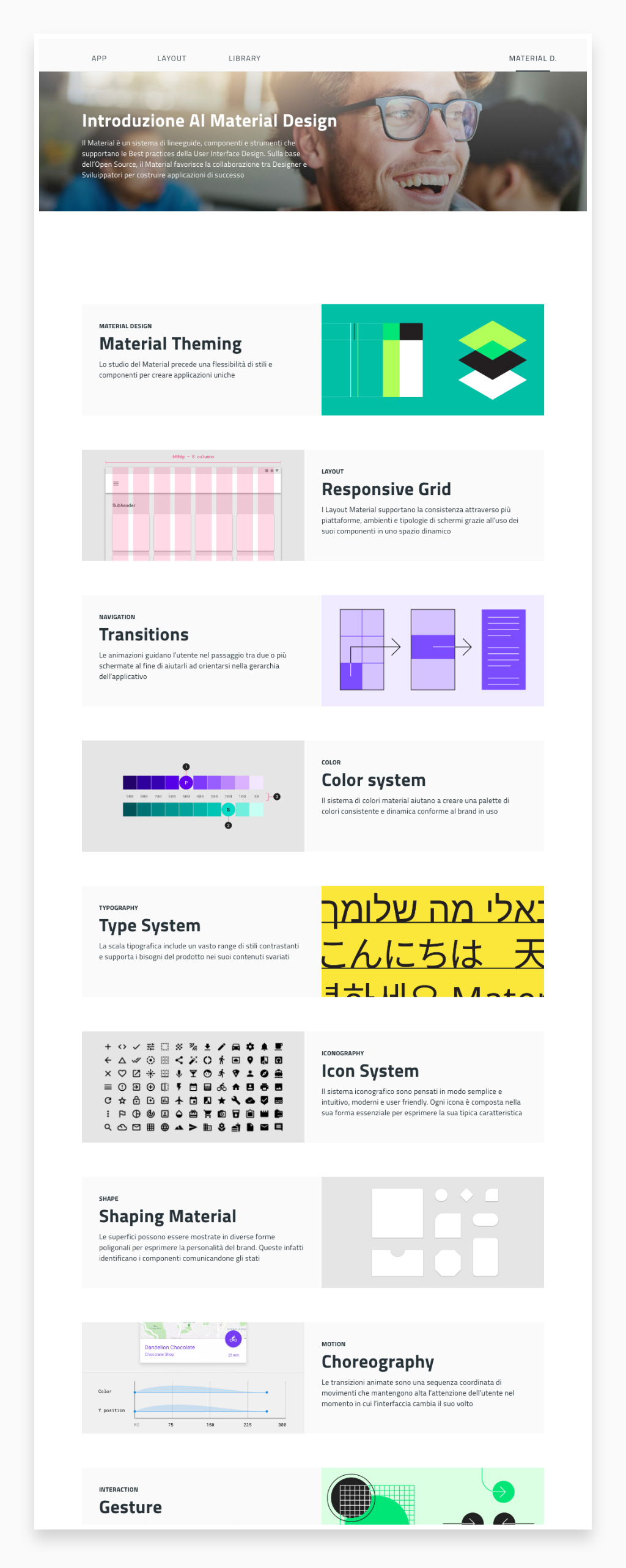
I consider Material Design one of the best Guidelines ever created, after so many years without a standard guidelines across the design community. That's why I always include a short introduction. This way everyone knows that the presented design is Material Based.
Material is an adaptable system of guidelines, components, and tools that support the best practices of user interface design. Backed by open-source code, Material streamlines collaboration between designers and developers, and helps teams quickly build beautiful products
Library Symbols
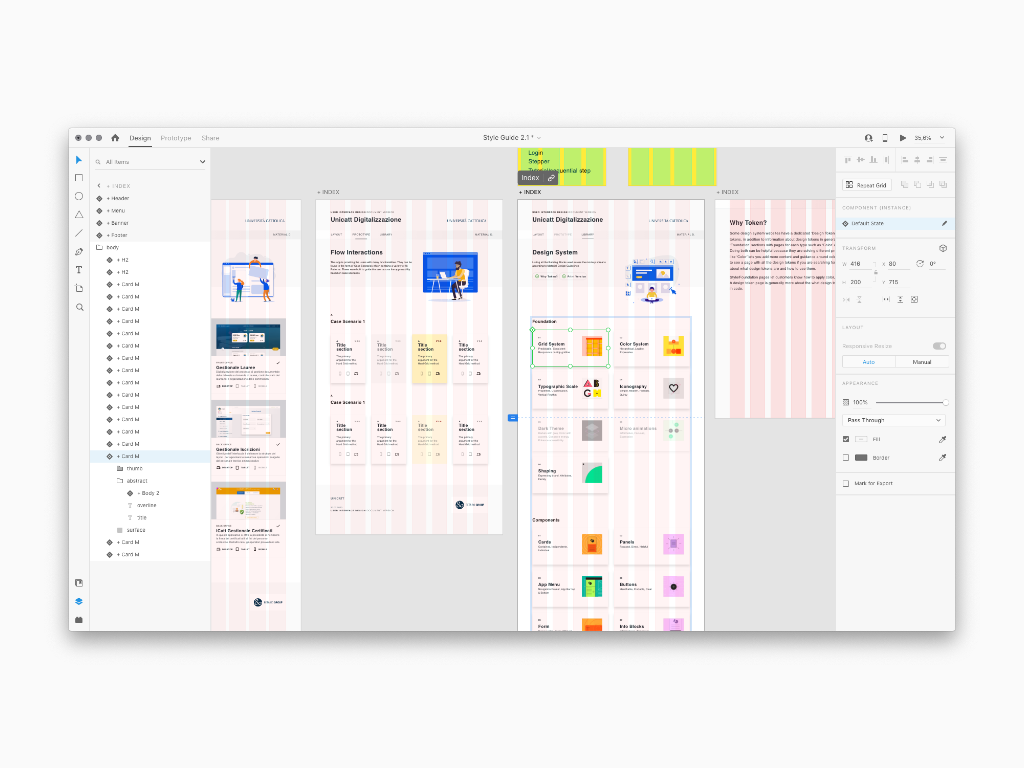
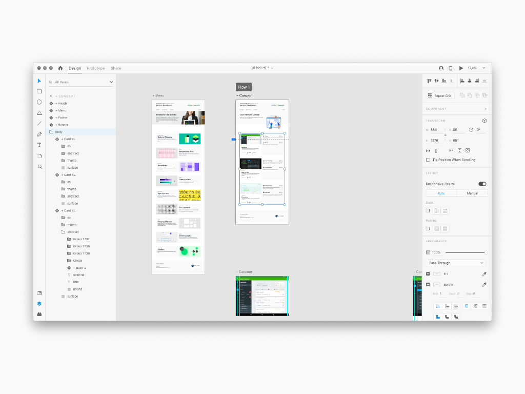
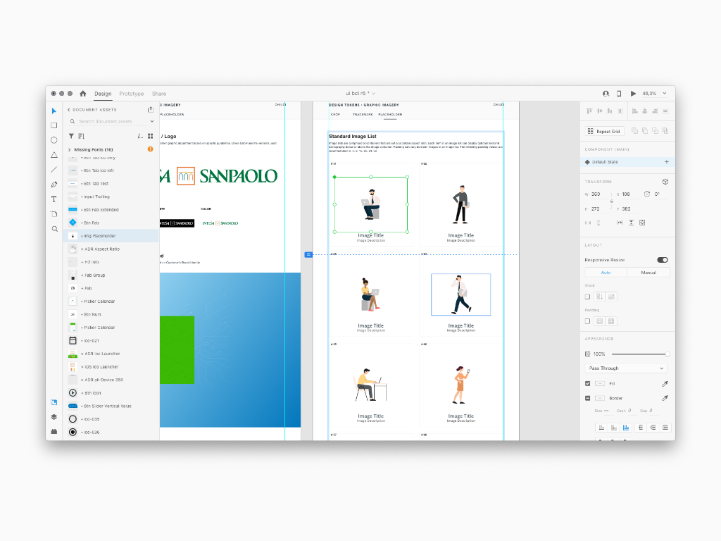
As the material is showcased screen by screen, anyone can have a look at the Style Guide created so far. Here any detail is conceived in a way that no misunderstanding is possible. As a matter of fact, this is to be considered a Ui Design Document
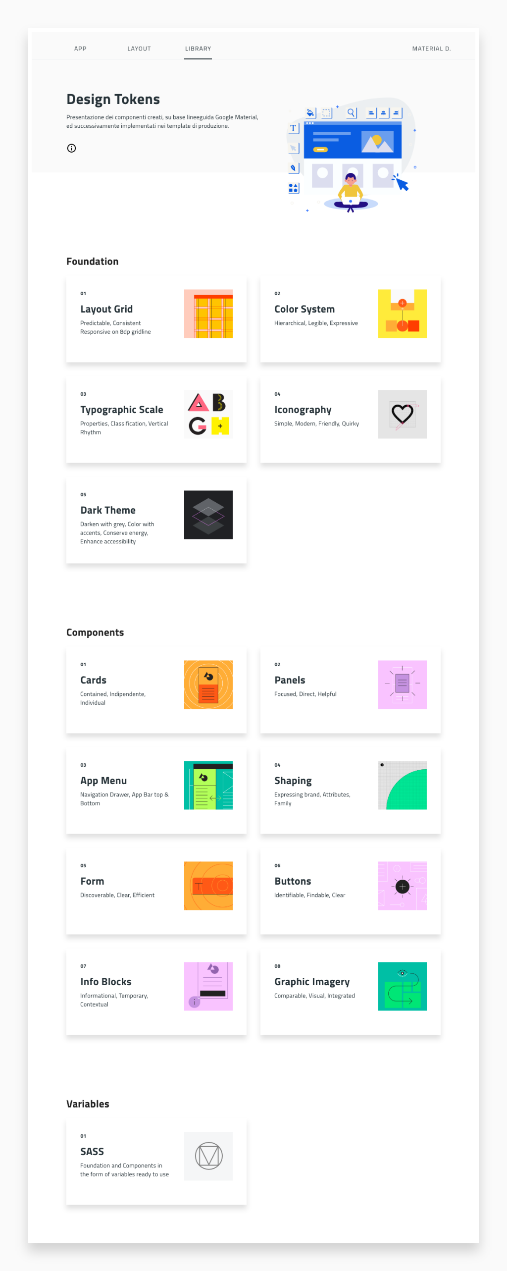
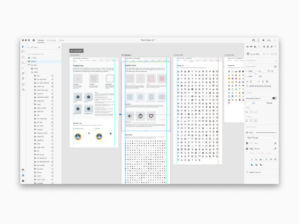
I split the tokens into Foundation and Components. Foundation is supposed to be the basic rules to consider at the beginning of every Ui project like layout Grid, Color System, Iconography, Scale Typo. Instead, Components sections is presenting the viewer every little blocks used across the app. Most
Prototyping
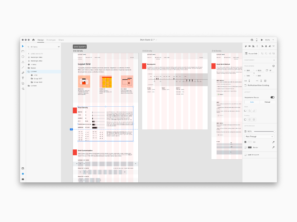
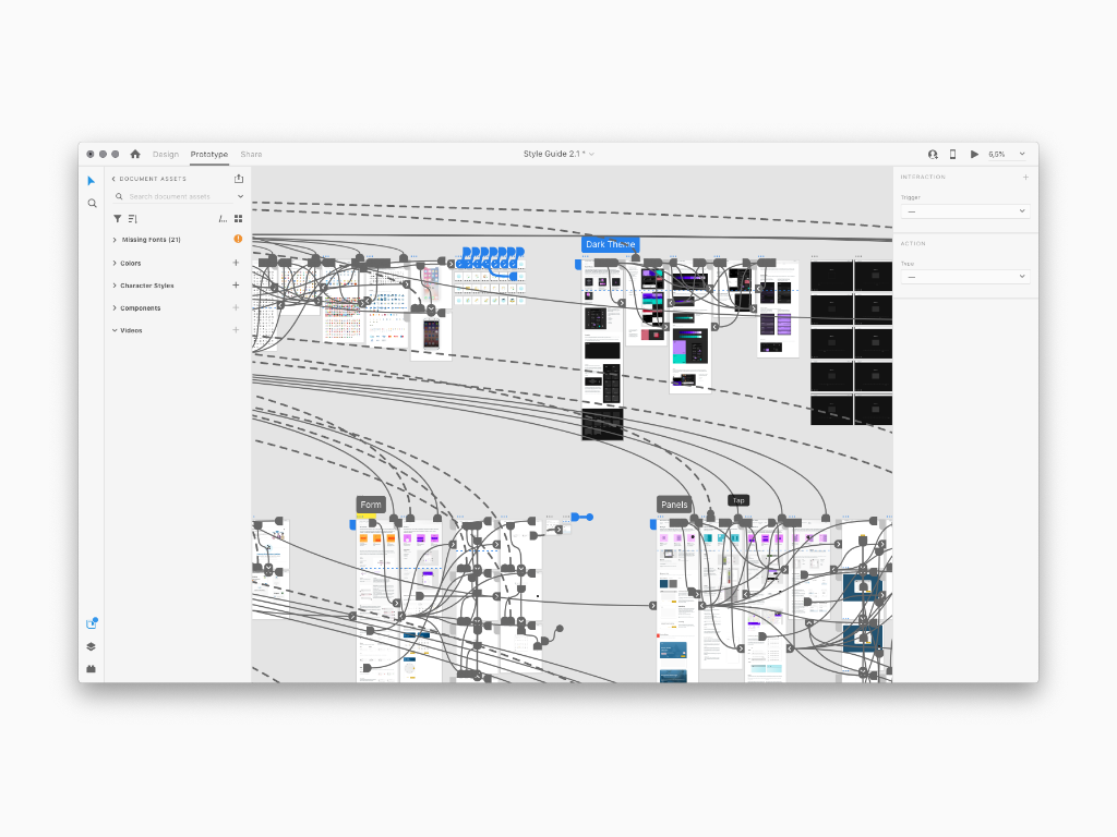
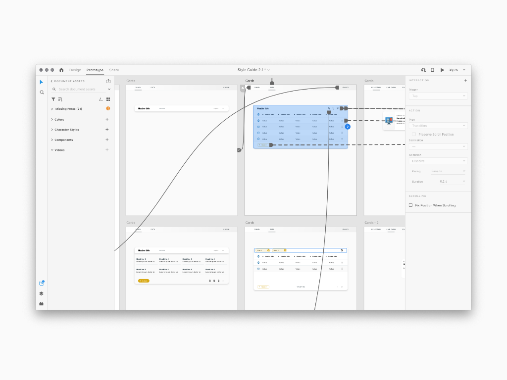
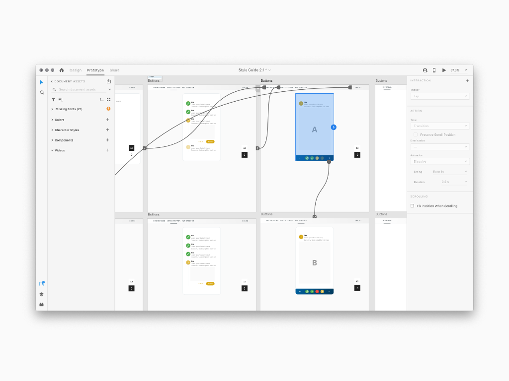
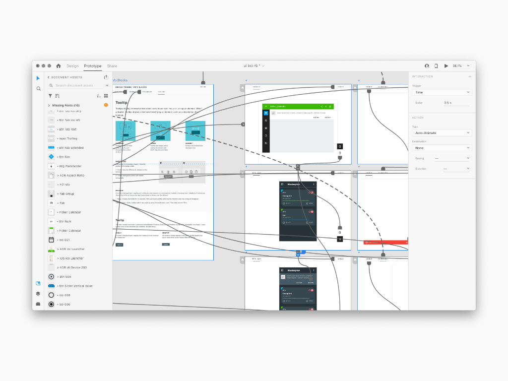
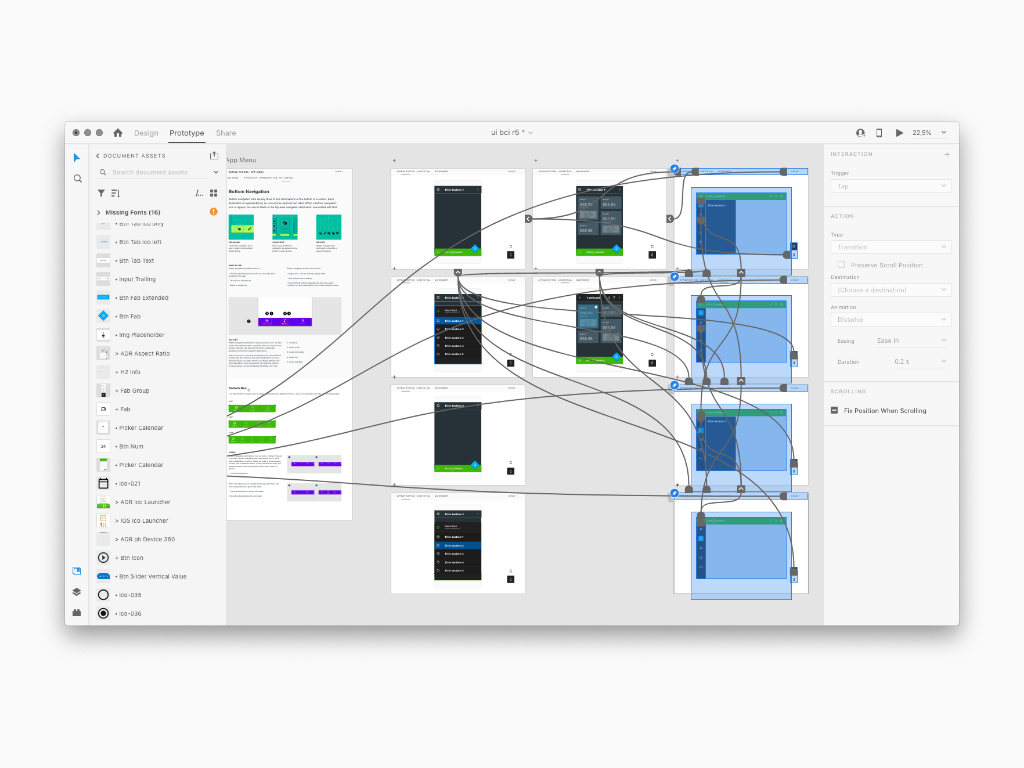
The entire Foundation section provided for a subdivision into as many sub-sections as there was information to be shown, such as the density of the Grid of a Layout and much more. Similarly the Building Blocks section was split into as many sub-sections as well as innumerable components. To facilitate understanding, each of these had been paired with an specific interactive area. This way, the user, customer or developer who browsed the document could navigate the demo area and interact with the component in order to understand the interactive behavior as well as the anatomy and its positioning within a Screen Region. Not least, the demos were also declined with respect to the viewport between desktops, tablets and smartphones. The amount of demos was high and therefore only some of them were reported here such as Dialogs, Input text, Buttons and so on
Some websites include a dedicated ‘Design Tokens’ page that includes all design tokens, in addition to information about design tokens in general. Others put them in ‘Style’ or ‘Foundation’ sections with pages for each type such as ‘Color’ and ‘Size’. Some do both. Doing both can be helpful because they are solving different problems. Having style pages like ‘Color’ lets you add more content and guidance around color usage. It can also be helpful to see a page with all the design tokens if you are searching for a specific token, or to learn about what design tokens are and how to use them. Foundation pages let customers know how to apply color, typography, size, motion, etc. A design token page is generally more about the what design tokens are and how to use them in code...keep reading
Scalability
Scalability is one of this library unique methodologies that enable the ramp fastest to any production volume. Being able to design scalable products and scale up production quickly is the foundation to easily deal with complexity in product demand. Be able to quickly replace problem products. Avoid supply chain shortages and delays. Quickly produce emergency replacements. Rapidly scaling up new products for very large new applications.
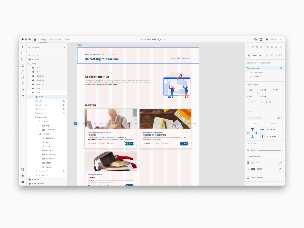
Application Hub
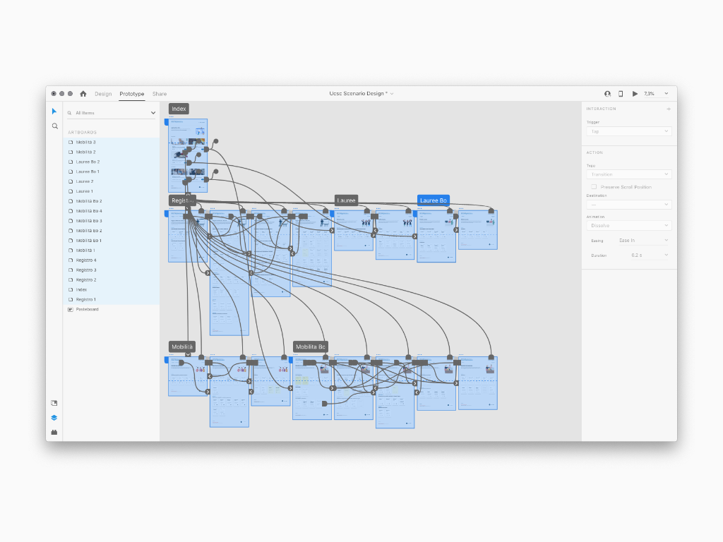
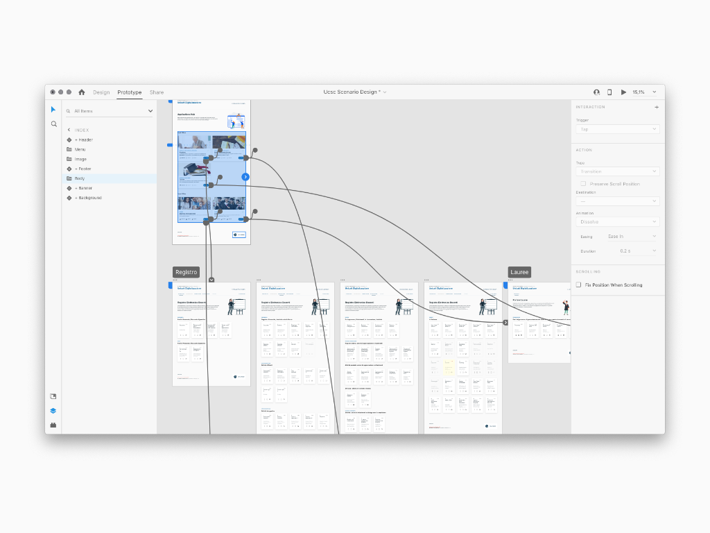
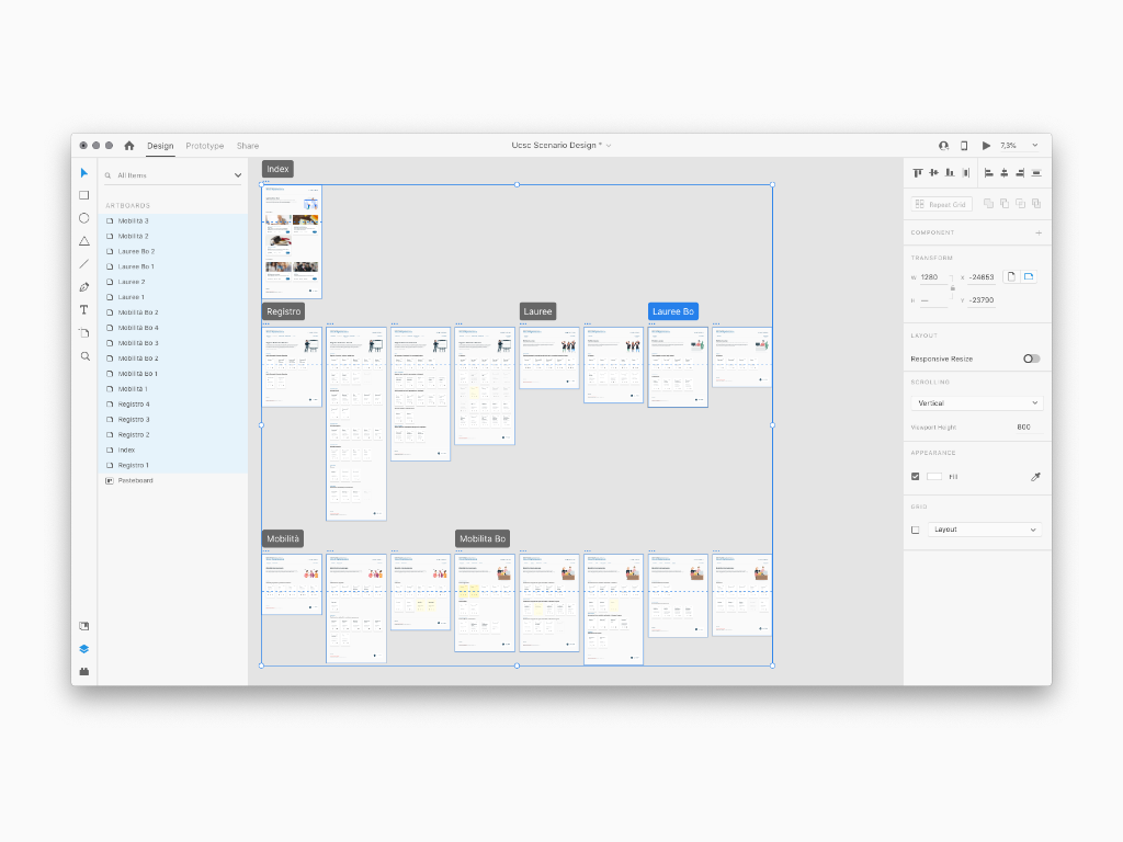
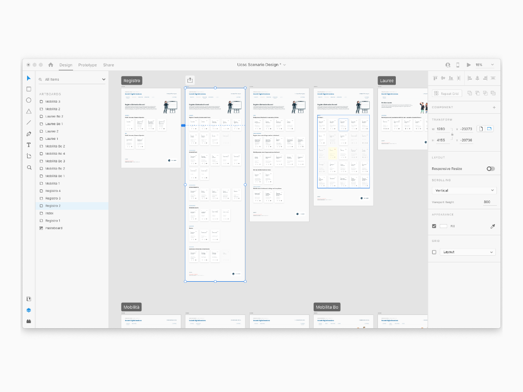
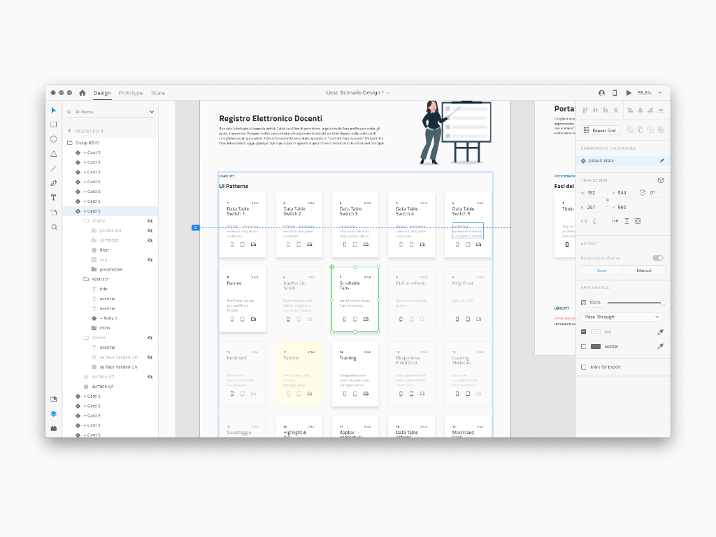
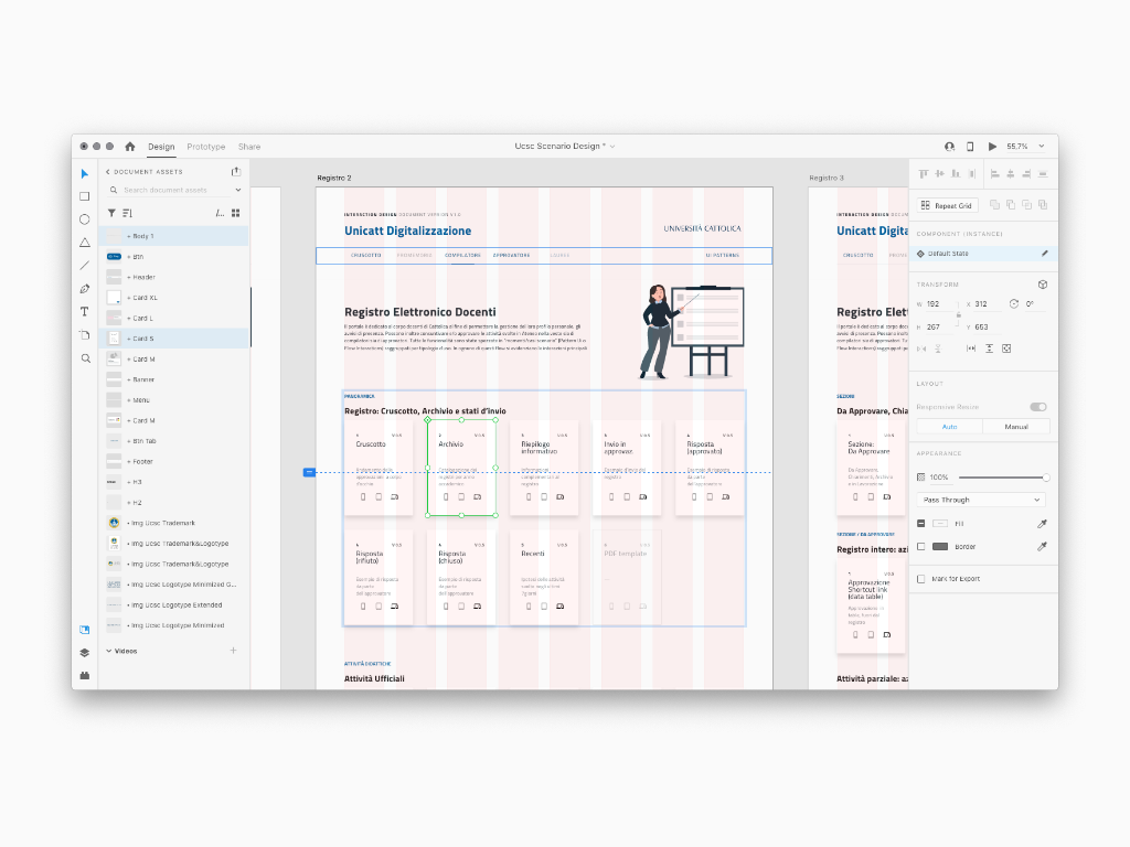
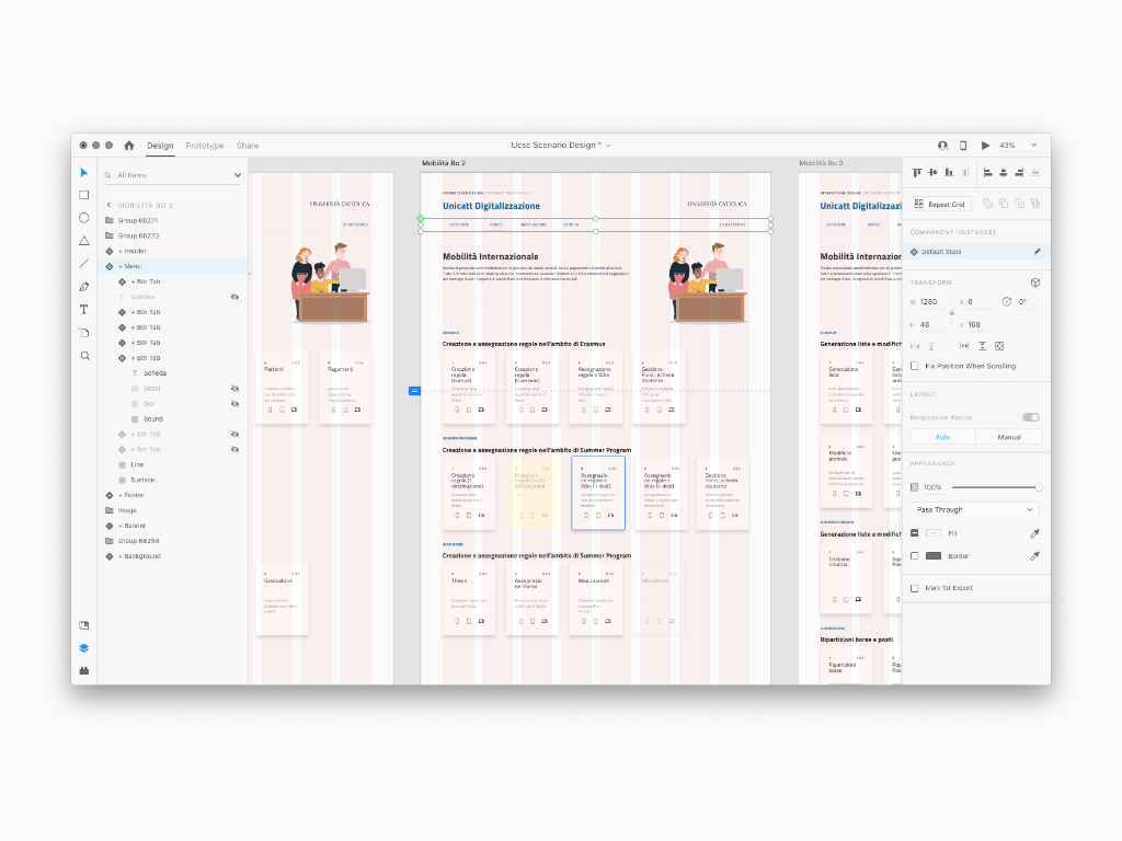
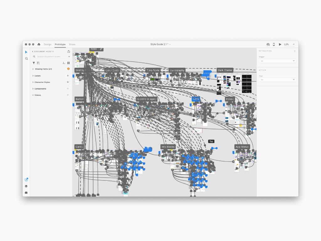
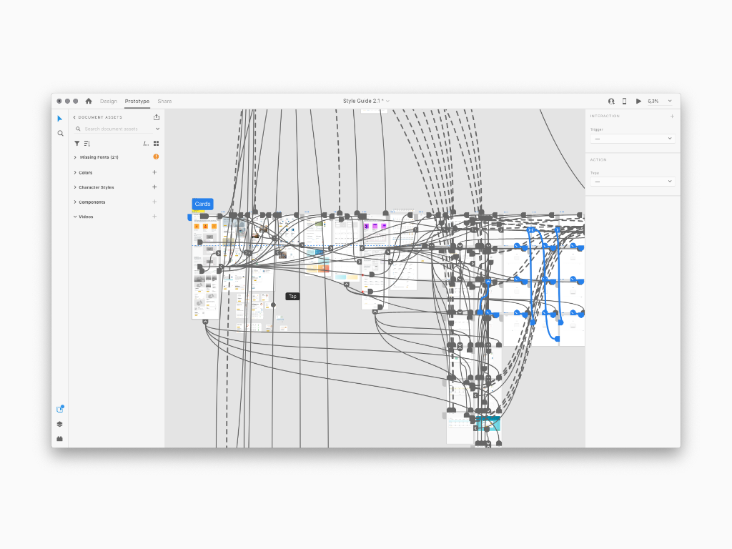
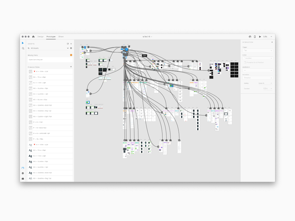
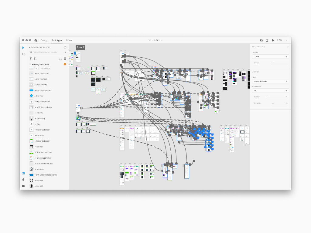
With this goals in mind, I conceived and designed a mainframe prototype to collect all the Interactive Flows I did for every web or native app so far. This way I could guide the users, and my coworkers as well, through each app workflow scenario. Let's say it was a bette good looking Scenario Board than a simple Excel file!
Other Applications Hub
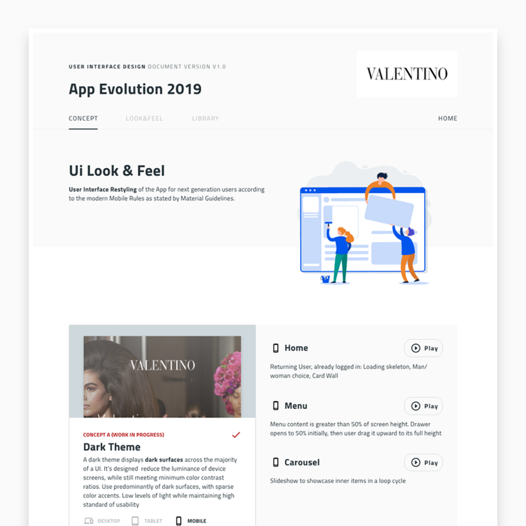
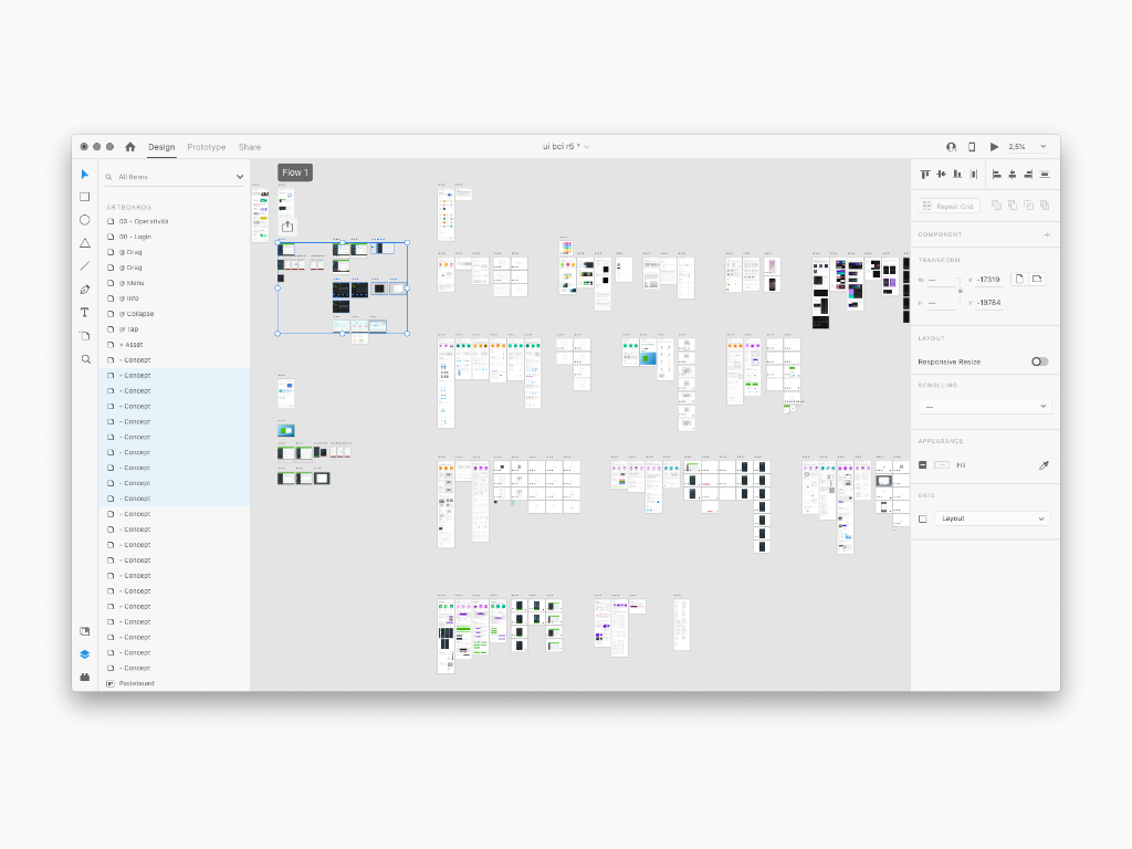
Following down below a previous versione of Cattolica Apps Hub and others apps such as Intesa San Paolo Service Dashboard, Valentino Evolution and inStore Feltrinelli apps
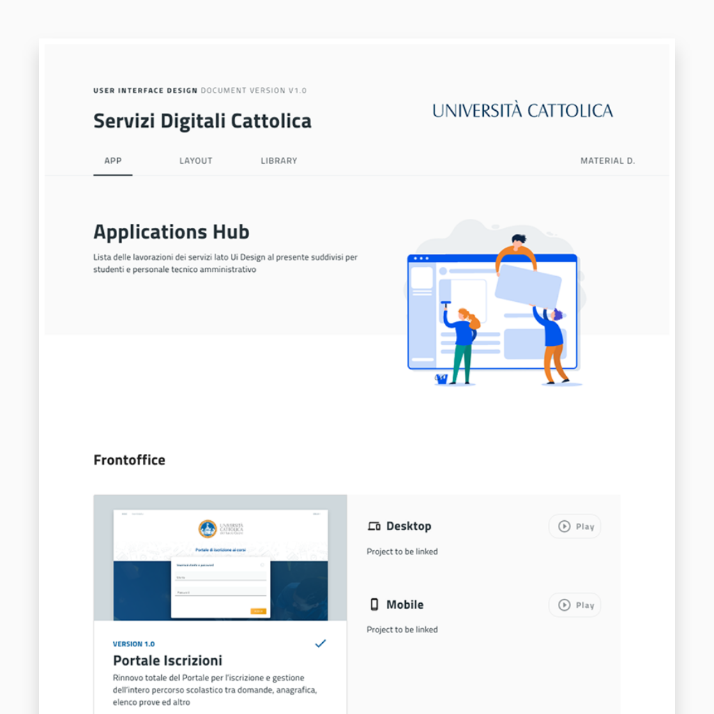
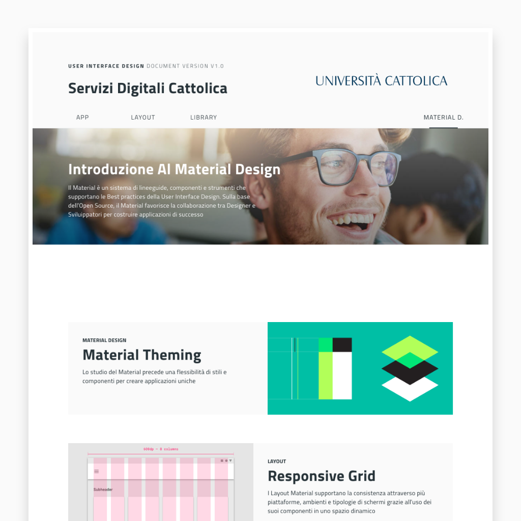
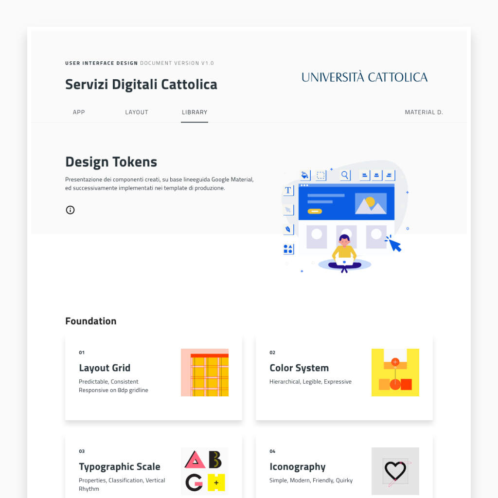
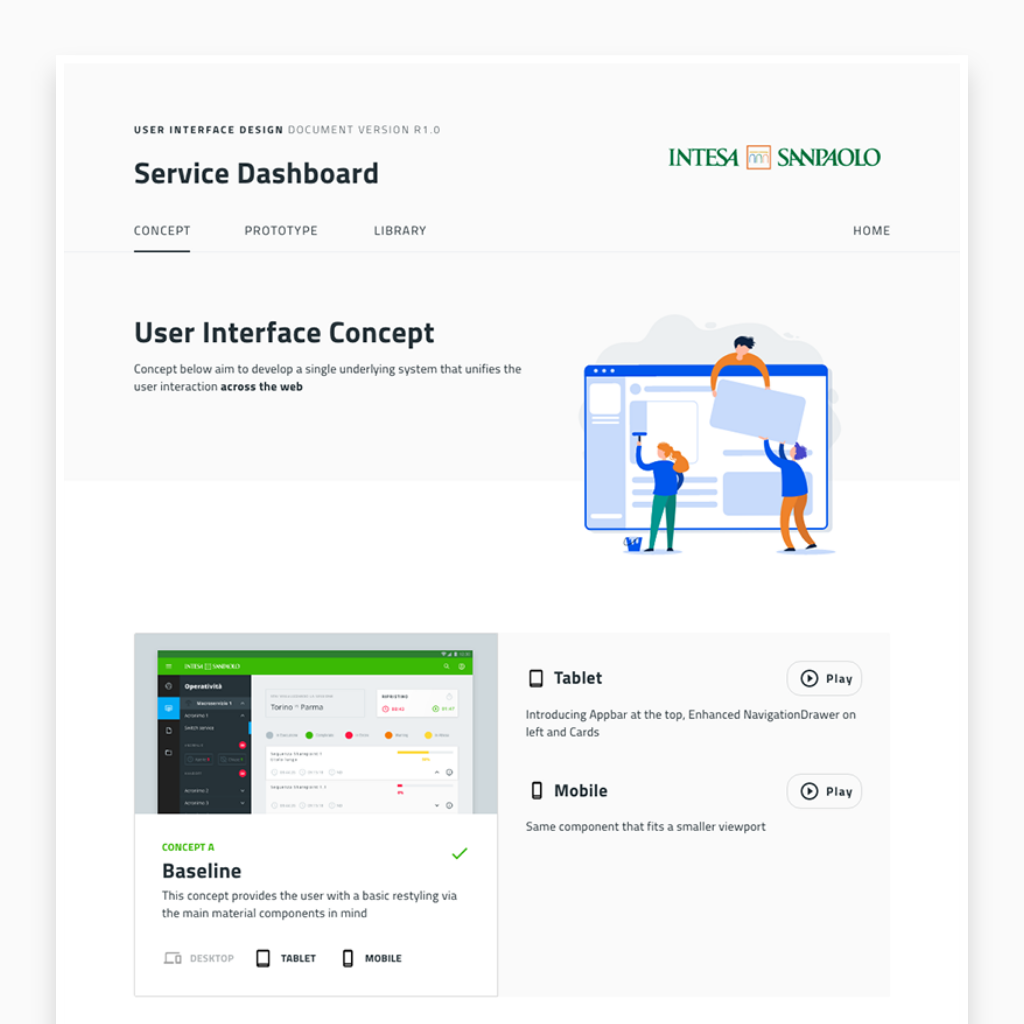
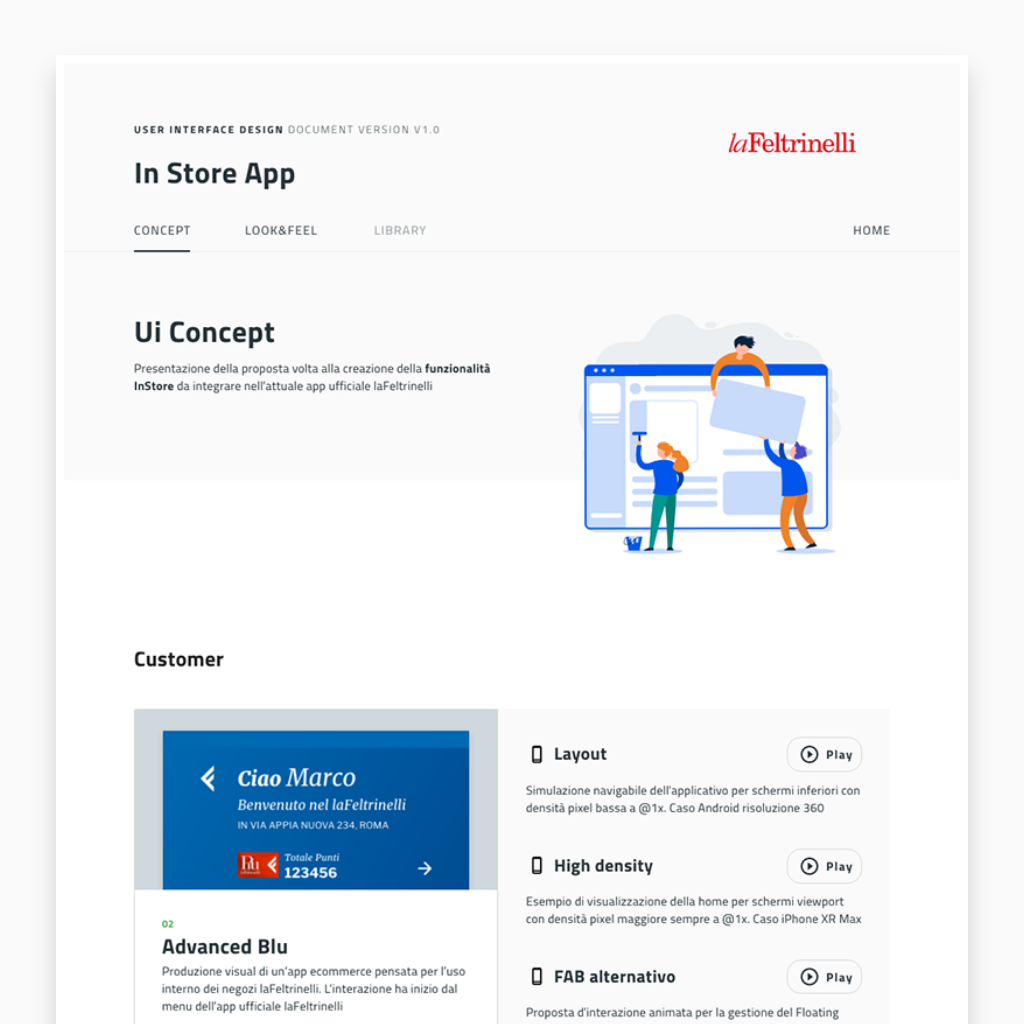
As time passed by, Cattolica Ui project demand was increasing greatly in quantity. The previous Style Guide version 0.5 could not hold the request anymore. With this in mind, I applied this new version until the 3.1 to make it working better. The given result can be viewed at the project Portale Iscrizione, Portale Lauree and Portale Mobilità
Interaction Design
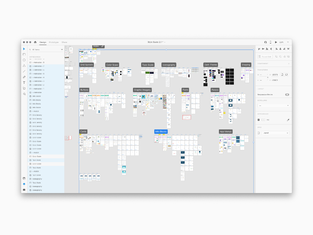
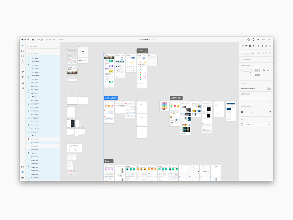
The Style Guide took its final form as an online navigable document and was split between Foundation and Components content; within these two it was possible to explore the details including images, text and even interactive demos according to the Cattolica design requirements. The result involved the construction of a library of symbols useful for carrying out the Ui iteration
Library Prototype
As explained above, the methodology developed so far includes a first step presenting the viewers an Introduction to Material Design and a Components overview. Saying this is a index reference to make it clear what this Ui project is all about. Also, a Layout section was created in order to showcase the main app's mockup sections
Foundation
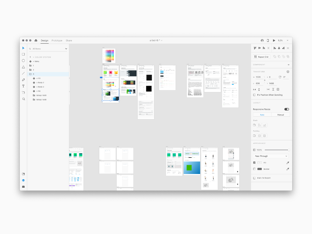
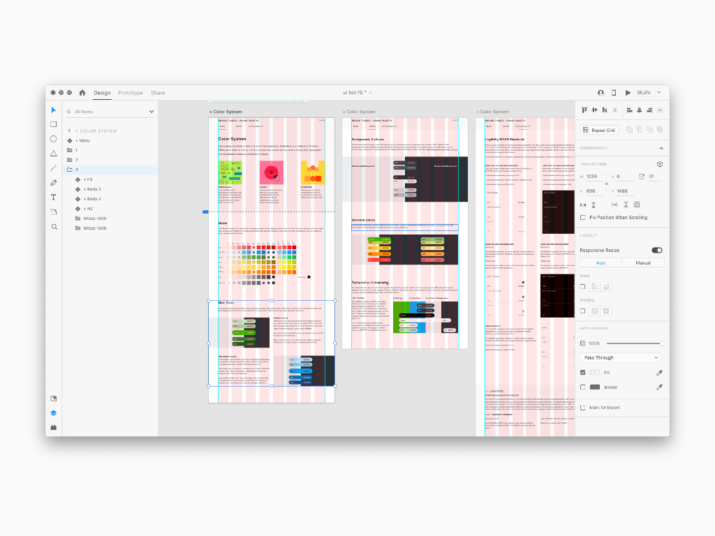
Again, the Foundation is providing the viewers with the main Ui Concept to consider before the iterative mockup production. In specific, Typography, Color were reviews to match the Material System guidelines
Tokens
We call these in many ways nowadays, Components or Building Blocks. Cattolica app's Building Blocks have been customized using Material Theming. Areas of customization include several Molecules and Atoms such as: Form, Cards, Panels, App Menus, Buttons, Shaping, Graphic Imagery, Info Blocks and even Sass Variables
.
This app's commitment was a chance to apply the new Style Guide method I developed. I though about an Introduction presenting the main Material Design rules, a list of the main mockup sections and a library overview. The given result can be viewed at the project Service Dashboard
Interaction Design
The Style Guide took its final form as an online navigable document and was split between Foundation and Components content; within these two it was possible to explore the details including images, text and even interactive demos according to Intesa San Paolo design requirements. The result involved the construction of a library of symbols useful for carrying out the Ui iteration
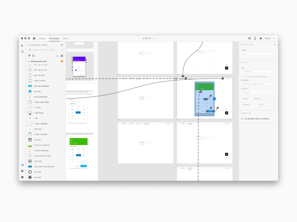
Library Prototype
The methodology developed so far includes a first step presenting the viewers an Introduction to Material Design and a Components overview. Saying this is a index reference to make it clear what this Ui project is all about.
Foundation
Material studies showcase the flexibility of Material Theming and components to create expressive and unique apps like Cruscotto by Banca Intesa. At this entry level, the Foundation is providing the viewers with the main Ui Concept to consider before the iterative mockup production
Tokens
We call these in many ways nowadays, Components or Building Blocks. This app’s Building Blocks have been customized using Material Theming. Areas of customization include several Molecules and Atoms such as: Form, Cards, Panels, App Menus, Buttons, Shaping, Graphic Imagery, Info Blocks and even Sass Variables


